Generalization Error & Bias/Variance Tradeoff#
Probability theory actually provides an equation that gives the expected value of the generalization error. The equation isn’t something that, in general, you can plug numbers into and evaluate, but it does give a guide for how the expected generalization error depends on properties of a model.
Note
The expected generalization error of a model (when predicting values on on new data) is referred to as its Mean Squared Error (MSE), and it depends on the “bias” and “variance” of a model.
This is perhaps the most important equation in predictive analytics!
Bias - systematic error incurred by approximating a more complicated reality with a model. In general, more complex models have a smaller bias because they have more flexibility to capture more subtleties in the relationships. Ideally, a model should have a low bias (yielding a reasonable reflection of reality).
Variance - a measure of how sensitive the form and predictions of a model are to the particular set of individuals used to build it. In general, more complex models have a higher variance (its form is very sensitive to the training data). Ideally, a modeling approach should have a low variance (the model shouldn’t be too dependent on the particular set of training data to which we have access).
Irreducible error - a measure of the inherent randomness built-in to any process we study. This error will be the same regardless which model is used; we are “stuck with it”. For instance, no matter what model we use for a fair coin, it will still make an error 50% of the time when making predictions.
Imagine trying to approximate a circle (reality) with an “\(n\)-gon” (shape with \(n\) sides, like pentagon, hexagon, octogon, etc.). A \(6\)-gon (hexagon, in red) has a fairly large bias (there’s a large and perceptible difference between the “model” and “reality”). A \(12\)-gon (in blue) has a much smaller bias - there’s not as much of a difference between the model and reality.
library(plotrix)
plot(0,0,xlim=c(-1,1),ylim=c(-1,1),xlab="",ylab="",col="white",xaxt="n",yaxt="n")
draw.circle(0,0,1,nv=100,lwd=3); draw.circle(0,0,1,nv=6,border="red",lwd=2)
draw.circle(0,0,1,nv=12,border="blue",lwd=2)

Bias / Variance illustration with linear regression#
Imagine that we want to predict an individual’s value of \(y\) from his or her value of \(x\) (e.g., predict \(y=\) hours per week watching TV using income as the predictor variable \(x\)) using a polynomial model of order \(m\).
The value of \(m\) is a choice, i.e., a tuning parameter of the model. The value of \(m\) mediates the tradeoff between the bias and variance of the resulting model. Increasing \(m\) increases the complexity of the model and increases its flexibility, but this comes at a price.
The following plot shows the relationship for the training sample we have on hand. There is some pretty clear curvature. What is the most appropriate choice for \(m\)?
set.seed(474)
x <- sort( 5*rbeta(15,.3,1)+5 )
y <- 108 - 100*3125/x^5 + runif(15,-10,10)
plot(y~x,ylim=c(0,140)); points(x,y,pch=20,cex=2)

Illustrating bias with linear regression#
Superimposed is a polynomial model of order 1 (black straight line), order 2 (red line predicting \(y\) from \(x\) and \(x^2\)), order 5 (blue), and order 8 (green).
set.seed(474)
x <- sort( 5*rbeta(15,.3,1)+5 )
y <- 108 - 100*3125/x^5 + runif(15,-10,10)
plot(y~x,ylim=c(0,140))
M <- lm(y~poly(x,1))
NEW <- data.frame(x=seq(from=5,to=10,length=100))
lines(NEW$x,predict(M,newdata=NEW),lwd=2)
M <- lm(y~poly(x,2))
NEW <- data.frame(x=seq(from=5,to=10,length=100))
lines(NEW$x,predict(M,newdata=NEW),col="red",lwd=2)
M <- lm(y~poly(x,5))
NEW <- data.frame(x=seq(from=5,to=10,length=100))
lines(NEW$x,predict(M,newdata=NEW),col="blue",lwd=2)
M <- lm(y~poly(x,8))
NEW <- data.frame(x=seq(from=5,to=10,length=100))
lines(NEW$x,predict(M,newdata=NEW),col="green",lwd=2)
points(x,y,pch=20,cex=2)

High bias illustration with linear regression#
set.seed(474)
x <- sort( 5*rbeta(15,.3,1)+5 )
y <- 108 - 100*3125/x^5 + runif(15,-10,10)
plot(y~x,ylim=c(0,140))
M <- lm(y~poly(x,1))
NEW <- data.frame(x=seq(from=5,to=10,length=100))
lines(NEW$x,predict(M,newdata=NEW),lwd=6)
M <- lm(y~poly(x,2))
NEW <- data.frame(x=seq(from=5,to=10,length=100))
lines(NEW$x,predict(M,newdata=NEW),col="red")
M <- lm(y~poly(x,5))
NEW <- data.frame(x=seq(from=5,to=10,length=100))
lines(NEW$x,predict(M,newdata=NEW),col="blue")
M <- lm(y~poly(x,8))
NEW <- data.frame(x=seq(from=5,to=10,length=100))
lines(NEW$x,predict(M,newdata=NEW),col="green")
points(x,y,pch=20,cex=2)

A choice of \(m=1\) (black) gives a model that is too simple. There’s a systematic difference between what the model can do (straight line) and what reality is (curve relationship). The line is consistently above the points for \(x=5-5.4\) but then consistently below the points for \(x=5.5-7.8\). The model is not flexible enough to capture the subtleties in the relationship.
Low bias illustration with linear regression#
set.seed(474)
x <- sort( 5*rbeta(15,.3,1)+5 )
y <- 108 - 100*3125/x^5 + runif(15,-10,10)
plot(y~x,ylim=c(0,140))
M <- lm(y~poly(x,1))
NEW <- data.frame(x=seq(from=5,to=10,length=100))
lines(NEW$x,predict(M,newdata=NEW))
M <- lm(y~poly(x,2))
NEW <- data.frame(x=seq(from=5,to=10,length=100))
lines(NEW$x,predict(M,newdata=NEW),col="red")
M <- lm(y~poly(x,5))
NEW <- data.frame(x=seq(from=5,to=10,length=100))
lines(NEW$x,predict(M,newdata=NEW),col="blue")
M <- lm(y~poly(x,8))
NEW <- data.frame(x=seq(from=5,to=10,length=100))
lines(NEW$x,predict(M,newdata=NEW),col="green",lwd=6)
points(x,y,pch=20,cex=2)

A choice of \(m=8\) (green) gives a model that is quite complex. It is so flexible that it’s able to capture quite well the bends in the relationship (low bias). However, something “feels off” about this model: it has a weird dip after \(x=8\). However, there’s no data there to indicate this is “wrong”! We can somewhat detect this “fishiness” by looking at the variance of the model.
Illustrating variance with linear regression#
The concept of bias is relatively clear (a straight line provides a “biased view” of the relationship if it in reality is curved), but the variance is a bit trickier.
To illustrate the concept of variance, lets look at what our models would look like if instead we were presented with a different training set.
In general, you can’t do this because you’ve only collected one training sample. In this case, I know what random process generated this data (the equation is below), we can generate another sample at will.
A “new” dataset can be made by picking a different set of random numbers.
Low Variance illustration with linear regression#
set.seed(474)
for (i in 1:10) {
  x <- sort( 5*rbeta(15,.3,1)+5 )
  y <- 108 - 100*3125/x^5 + runif(15,-10,10)
  if(i==1) {
    plot(y~x,ylim=c(0,140))
    x.orig<-x
    y.orig<-y}
  M <- lm(y~poly(x,1))
  NEW <- data.frame(x=seq(from=5,to=10,length=100))
  lines(NEW$x,predict(M,newdata=NEW),lwd=ifelse(i==1,4,1),col=ifelse(i==1,2,1))
}
points(x.orig,y.orig,pch=20,cex=2)
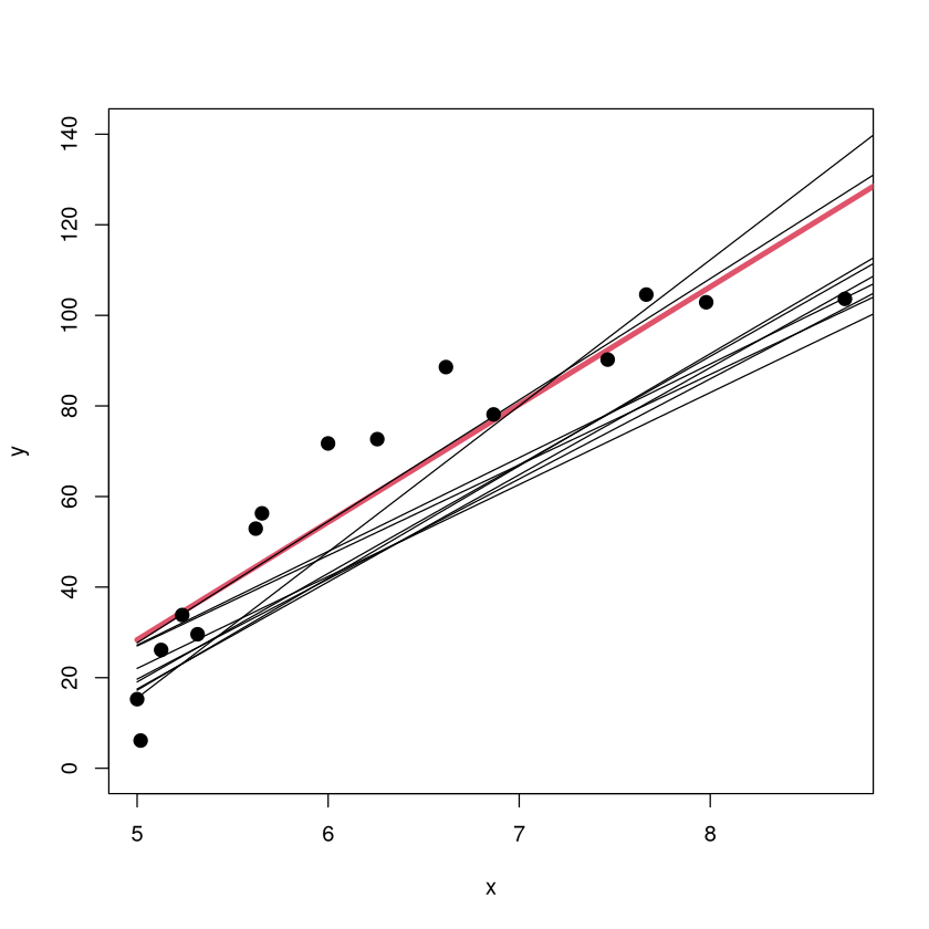
The scatterplot of the original data is shown along with the original \(m=1\) model (red). The models fit on 9 other training sets are shown in black (but without the corresponding sample points since that would crowd up the plot). The \(m=1\) model has a low variance because the form of the model looks pretty consistent from sample to sample (about the same slope, small shifts up/down).
High Variance illustration with linear regression#
set.seed(474)
for (i in 1:10) {
  x <- sort( 5*rbeta(15,.3,1)+5 )
  y <- 108 - 100*3125/x^5 + runif(15,-10,10)
  if(i==1) {
    plot(y~x,ylim=c(-80,240))
    x.orig<-x
    y.orig<-y}
  M <- lm(y~poly(x,8))
  NEW <- data.frame(x=seq(from=5,to=10,length=100))
  if( i %in% c(1:3,6,9)) {
  lines(NEW$x,predict(M,newdata=NEW),lwd=ifelse(i==1,4,1),col=ifelse(i==1,2,1)) }
}
points(x.orig,y.orig,pch=20,cex=2)

The scatterplot of the original training data is shown (with different \(y\) ranges) along with the original \(m=8\) model (red). The models on 5 other training sets are shown in black (without the corresponding sample points). The \(m=8\) model has a high variance because the form of the model can look very different from sample to sample. The form of the model is highly dependent on what individuals happened to be in the training data.
Bias/Variance illustration with Nearest Neighbors#
Imagine using \(K\)-nearest neighbors to classify an individual into the orange class or blue class based on the values of two characteristics (\(x_1\) displayed horizontally and \(x_2\) displayed vertically). The tuning parameter \(K\) (number of neighbors used to make the classification) changes the model’s bias and variance. Increasing \(K\) increases bias (poorer fit) but decreases variance (``simpler” model less sensitive to training data).
library(MASS)
library(lattice)
# set the seed to reproduce data generation in the future
seed <- 44739
set.seed(seed)

# generate two classes means
Sigma <- matrix(c(1,0,0,1),nrow = 2, ncol = 2)
means_1 <- mvrnorm(n = 10, mu = c(1.5,0), Sigma)
means_2 <- mvrnorm(n = 10, mu = c(0,1.5), Sigma)

# pick an m_k at random with probability 1/10
# function to generate observations
genObs <- function(classMean, classSigma, size, ...)
{
  # check input
  if(!is.matrix(classMean)) stop("classMean should be a matrix")
  nc <- ncol(classMean)
  nr <- nrow(classMean)
  if(nc != 2) stop("classMean should be a matrix with 2 columns")
  if(ncol(classSigma) != 2) stop("the dimension of classSigma is wrong")

  # mean for each obs
    # pick an m_k at random
  meanObs <- classMean[sample(1:nr, size = size, replace = TRUE),]
  obs <- t(apply(meanObs, 1, function(x) mvrnorm(n = 1, mu = x, Sigma = classSigma )) )
  colnames(obs) <- c('x1','x2')
  return(obs)
}

obs100_1 <- genObs(classMean = means_1, classSigma = Sigma/5, size = 50)
obs100_2 <- genObs(classMean = means_2, classSigma = Sigma/5, size = 50)

# generate label
y <- rep(c(0,1), each = 50)

# training data matrix
trainMat <- as.data.frame(cbind(y, rbind(obs100_1, obs100_2)))

# plot them
with(trainMat, xyplot(x2 ~ x1,groups = y, col=c('blue', 'orange'),pch=20))

Bias/Variance illustration: 1-NN (low bias/high variance)#
#k nearest-neighbor methods
library(class)
# get the range of x1 and x2
rx1 <- range(trainMat$x1)
rx2 <- range(trainMat$x2)
# get lattice points in predictor space
px1 <- seq(from = rx1[1], to = rx1[2], by = 0.05 )
px2 <- seq(from = rx2[1], to = rx2[2], by = 0.05 )
xnew <- expand.grid(x1 = px1, x2 = px2)

# get the contour map
knn1 <- knn(train = trainMat[,2:3], test = xnew, cl = trainMat[,1], k = 1, prob = TRUE)
prob <- attr(knn1, "prob")
prob <- ifelse(knn1=="1", prob, 1-prob)
prob1 <- matrix(prob, nrow = length(px1), ncol = length(px2))

# Figure 2.2
par(mar = rep(2,4))
contour(px1, px2, prob1, levels=0.5, labels="", xlab="", ylab="", main=
    "1-nearest neighbor", axes=FALSE)
points(trainMat[,2:3], col=ifelse(trainMat[,1]==1, "coral", "cornflowerblue"),pch=20)
points(xnew, pch=".", cex=1.2, col=ifelse(prob1>0.5, "coral", "cornflowerblue"))
box()

The ``decision boundary” for the 1-NN classifier is complex. Low bias (no misclassifications), but the model has a high variance (the features of the decision boundary are very sensitive to the locations of the points in this training sample). It seems unlikely these boundaries will generalize well to new data.
Bias/Variance illustration: 1-NN (low bias/high variance)#
library(MASS)
# set the seed to reproduce data generation in the future
seed <- 1976
set.seed(seed)

# generate two classes means
Sigma <- matrix(c(1,0,0,1),nrow = 2, ncol = 2)
means_1 <- mvrnorm(n = 10, mu = c(1.5,0), Sigma)
means_2 <- mvrnorm(n = 10, mu = c(0,1.5), Sigma)

obs100_1 <- genObs(classMean = means_1, classSigma = Sigma/5, size = 50)
obs100_2 <- genObs(classMean = means_2, classSigma = Sigma/5, size = 50)

# generate label
y <- rep(c(0,1), each = 50)

# training data matrix
trainMat <- as.data.frame(cbind(y, rbind(obs100_1, obs100_2)))

# get the contour map
knn1 <- knn(train = trainMat[,2:3], test = xnew, cl = trainMat[,1], k = 1, prob = TRUE)
prob <- attr(knn1, "prob")
prob <- ifelse(knn1=="1", prob, 1-prob)
prob1 <- matrix(prob, nrow = length(px1), ncol = length(px2))

# Figure 2.2
par(mar = rep(2,4))
contour(px1, px2, prob1, levels=0.5, labels="", xlab="", ylab="", main=
    "1-NN on other training sample", axes=FALSE)
points(trainMat[,2:3], col=ifelse(trainMat[,1]==1, "coral", "cornflowerblue"),pch=20)
points(xnew, pch=".", cex=1.2, col=ifelse(prob1>0.5, "coral", "cornflowerblue"))
box()

Indeed, on another training sample (generated via the same random process that generated the first), the decision boundary looks extraordinarily different.
Bias/Variance illustration: 10-NN (high bias/low variance)#
library(MASS)
# set the seed to reproduce data generation in the future
seed <- 44739
set.seed(seed)

# generate two classes means
Sigma <- matrix(c(1,0,0,1),nrow = 2, ncol = 2)
means_1 <- mvrnorm(n = 10, mu = c(1.5,0), Sigma)
means_2 <- mvrnorm(n = 10, mu = c(0,1.5), Sigma)

obs100_1 <- genObs(classMean = means_1, classSigma = Sigma/5, size = 50)
obs100_2 <- genObs(classMean = means_2, classSigma = Sigma/5, size = 50)

# generate label
y <- rep(c(0,1), each = 50)

# training data matrix
trainMat <- as.data.frame(cbind(y, rbind(obs100_1, obs100_2)))

# get the range of x1 and x2
rx1 <- range(trainMat$x1)
rx2 <- range(trainMat$x2)
# get lattice points in predictor space
px1 <- seq(from = rx1[1], to = rx1[2], by = 0.1 )
px2 <- seq(from = rx2[1], to = rx2[2], by = 0.1 )
xnew <- expand.grid(x1 = px1, x2 = px2)

# get the contour map
knn1 <- knn(train = trainMat[,2:3], test = xnew, cl = trainMat[,1], k = 10, prob = TRUE)
prob <- attr(knn1, "prob")
prob <- ifelse(knn1=="1", prob, 1-prob)
prob1 <- matrix(prob, nrow = length(px1), ncol = length(px2))

# Figure 2.2
par(mar = rep(2,4))
contour(px1, px2, prob1, levels=0.5, labels="", xlab="", ylab="", main=
    "10-nearest neighbor", axes=FALSE)
points(trainMat[,2:3], col=ifelse(trainMat[,1]==1, "coral", "cornflowerblue"),pch=20)
points(xnew, pch=".", cex=1.2, col=ifelse(prob1>0.5, "coral", "cornflowerblue"))
box()

The “decision boundary” for the 10-NN classifier is relatively simple. Higher bias (some misclassifications), but the model has a lower variance (the features of the decision boundary won’t be as sensitive to the locations of the points in this training sample). This boundary is ``less jagged” should generalize better.
Bias/Variance illustration: 10-NN (high bias/low variance)#
library(MASS)
# set the seed to reproduce data generation in the future
seed <- 1976
set.seed(seed)

# generate two classes means
Sigma <- matrix(c(1,0,0,1),nrow = 2, ncol = 2)
means_1 <- mvrnorm(n = 10, mu = c(1.5,0), Sigma)
means_2 <- mvrnorm(n = 10, mu = c(0,1.5), Sigma)

obs100_1 <- genObs(classMean = means_1, classSigma = Sigma/5, size = 50)
obs100_2 <- genObs(classMean = means_2, classSigma = Sigma/5, size = 50)

# generate label
y <- rep(c(0,1), each = 50)

# training data matrix
trainMat <- as.data.frame(cbind(y, rbind(obs100_1, obs100_2)))

# get the contour map
knn1 <- knn(train = trainMat[,2:3], test = xnew, cl = trainMat[,1], k = 10, prob = TRUE)
prob <- attr(knn1, "prob")
prob <- ifelse(knn1=="1", prob, 1-prob)
prob1 <- matrix(prob, nrow = length(px1), ncol = length(px2))

# Figure 2.2
par(mar = rep(2,4))
contour(px1, px2, prob1, levels=0.5, labels="", xlab="", ylab="", main=
    "10-NN other training sample", axes=FALSE)
points(trainMat[,2:3], col=ifelse(trainMat[,1]==1, "coral", "cornflowerblue"),pch=20)
points(xnew, pch=".", cex=1.2, col=ifelse(prob1>0.5, "coral", "cornflowerblue"))
box()

Indeed, on another training sample (generated via the same random process that generated the first), the decision boundary looks quite similar.
Variance illustration with Partition Models (come back to this after tree unit)#
One of the cons of a vanilla partition model (to be covered in a future unit) is that it has ``high variance”, meaning that the form of the model (i.e., the decision tree) can look VERY different depending on what set of individuals happens to be in the training data.
Now we look at partition models trying to predict the body fat percentage of individuals based on physical measurements (like abdomen/wrist/knee/neck circumference, age, height). The trees are built on two different samples of 100 individuals in the \(BODYFAT\) dataset. Notice how much the structure of the tree changes from one sample to the other.
Variance illustration with Partition Models (come back to this after tree unit)#
library(regclass)
Show code cell output
Loading required package: bestglm
Loading required package: leaps
Loading required package: VGAM
Loading required package: stats4
Loading required package: splines
Loading required package: rpart
Loading required package: randomForest
randomForest 4.7-1.2
Type rfNews() to see new features/changes/bug fixes.
Important regclass change from 1.3:
All functions that had a . in the name now have an _
all.correlations -> all_correlations, cor.demo -> cor_demo, etc.
Attaching package: ‘regclass’
The following object is masked from ‘package:lattice’:

    qq
data(BODYFAT)
set.seed(474)
TRAIN <- BODYFAT[sample(nrow(BODYFAT),100),]
visualize_model(rpart(BodyFat~.,data=TRAIN,cp=0.001))

Variance illustration with Partition Models (come back to this after tree unit)#
Looks very different than the first tree, indicating that the tree-building procedure has a high variance.
data(BODYFAT); set.seed(1976); TRAIN <- BODYFAT[sample(nrow(BODYFAT),100),]
visualize_model(rpart(BodyFat~.,data=TRAIN,cp=0.001))

Tradeoff Between Bias and Variance#
Bias - Ideally, a model should have a low bias (yielding a reasonable reflection of reality).
Variance - Ideally, a modeling approach should have a low variance (the form and structure of the model shouldn’t be too dependent on the particular set of training data to which we have access).
To minimize a model’s generalization error, we need to minimize both its bias and its variance simultaneously, but this typically isn’t possible. Why? There is usually a tug-of-war between these two quantities.
Bias-Variance Tradeoff catch 22#
In effect, when building a model, we have the following “Catch 22”.
As we extract more information from the individuals in the training data, we are able to better capture the subtleties in the relationships that exist between the features of individuals in the population. The bias of a model goes down.
As we extract more information from the individuals in the training data, we make the model more and more sensitive to the features of whatever individuals happen to be in the training data. The variance goes up.
Note
The fundamental goal of a predictive model is to capture as much as possible about the relationships in the data while using the least amount of information possible! There will be a “sweet” spot of extracting just enough information from the individuals in the training data that lets the model generalize the best to new individuals. We “guess” where that is with crossvalidation!
Bias-Variance Tradeoff additional perspective#
Making a model more complex so that it provides a “better” reflection of reality will make its bias smaller, but it makes the form of the model more sensitive to the particular set of individuals in the training data, so its variance will increase.
Simpler models tend to be less sensitive to the particular set of individuals in the training data and have low variance, but they can be too simple and miss out on important aspects of relationships in the data, leading to a high bias.
There is an optimal level of complexity (number of predictors, number of rules, number of neighbors, number of trees, etc.) associated with each model, but these levels are problem-dependent. There is a fine line between a model being overfit (too complex, won’t generalize well) and being underfit (too simple, makes large errors). When we estimate the model’s generalization error and choose “the best”, we are attempting to find that right level of complexity.
Mean Squared (Total) Error aka Generalization Error#
All practitioners of predictive analytics must have a deep understanding of the following figure.
Discussion of generalization and overfitting#
At the risk of belaboring the point, now we talk about generalization and overfitting in the context of more relatable real-world examples.
Understanding how the generalization “works” via the bias-variance tradeoff and how to strike the right balance between overfitting and underfitting is probably the most important conceptual topic in predictive analytics!
What is “generalizing” in the real world?#
Building a “good” predictive model is roughly analogous to you coming up with a description of the person you are going to marry. What do you think would be a good strategy?
Obviously, you can’t go into too much detail. Your description probably wouldn’t include the person’s ethnicity, hair/eye color, etc., because that could be really far off.
However, your description could include some basic details without running the risk of being too wrong: you could specify gender, rough height (between 4.5 and 6.5 feet tall?), has hair, has a mouth, has a nose, has arms, etc.
In this case, your “model” is going to have to be relatively simple to generalize well (predict this “new” person you haven’t seen yet).
Generalizing Revisited and the Goal of Predictive Analytics#
Note
You could say the goal of predictive analytics is to come up with a model that captures the most it can about the relationships in the data while using as little information as possible.
The model you end up selecting might not perfectly fit any particular dataset (and so it isn’t a great description of any data you’ve collected), but it might do a good job of generalizing if it represents all “new” datasets equally well.
Model a Frenchie#
The 3 pictures on the left have an extreme level of detail and represent the individual dogs on which the picture was based very well. However, they don’t “generalize well” because other Frenchies can look quite different (the details included in the pictures won’t generally be present in other dogs). The picture on the right doesn’t really look like any particular Frenchie, but it WILL do a reasonable job of generalizing since it represents all Frenchies equally well (the details that are included in the picture are found in nearly all Frenchies).
Think of building a model as making a picture#
As we discuss building and selecting predictive models, I think it is quite useful to think of it like making a “picture” of the quantity we wish to predict. Think of the data as the subject or muse upon which we are basing our picture
The picture will be drawn to, of course, resemble the subject.
You don’t want a picture that leaves out too much detail because the essential details make the picture look good.
You don’t want to the picture to start resembling the subject too closely, because the subject will have unique features and characteristics that (if included) would give a misleading impression of the whole.
Your model will never be perfect: brand new individuals will always have quirks and details that haven’t yet been observed in the collected data!
One standard deviation rule revisited#
The one standard deviation rule gave us a guideline for what models are “acceptable” and which are not.
Note
The one standard deviation rule says that two models whose estimated generalization errors are within one standard deviation of each other are essentially equivalent. There are no compelling statistical reasons to prefer one over the other.
Now this rule makes sense! The model with the lowest estimated generalization error is rarely the best anyway (though we usually still end up picking it). The 1 SD rule gives a reasonable “buffer of equivalence” between models.