Clustering Algorithm: Hierarchical clustering#
Hierarchical clustering overview#
The \(K\)-means algorithm essentially tries to solve the clustering problem all at once. Hierarchical clustering build clusters sequentially.
Agglomerative - ``bottom up” approach that starts with every individual in their own cluster, then merges clusters together one by one until everyone is in the same cluster.
Divisive - ``top down” approach where all individuals start in the same cluster, then splits are performed in much the same manner as they are in partition models to divide the individuals into smaller and smaller clusters.
The number of clusters and cluster identities are chosen by looking at a dendrogram, which graphically displays the cluster merging process.
Dissimilarity Between Clusters#
The default measure for the dissimilarity between two individuals is the Euclidean distance. However, how do we measure the dissimilarity between clusters, which are a collection of individuals?
Complete-linkage clustering defines the dissimilarity as the maximum distance between any two individuals in different clusters.
Single-linkage clustering defines the dissimilarity as the minimum distance between any two individuals in difference clusters.
Average-linkage clustering defines the dissimilarity as the average distance between all pairs of individuals in different clusters.
Ward’s method defines the dissimilarity as the increase in the the sum of squared distances between individuals and the cluster centers when the clusters are merged.
Since each merging of clusters take place as a larger dissimilarity than the last merge, we can decide a threshold for what makes clusters ``too dissimilar” to determine the number of clusters.
Imagine that at some point in the merging process we have two clusters (denoted by the red and blue dots). How do we measure the dissimilarity between these clusters? Here’s how complete linkage and single linkage would do it.
x1 <- c(3,4.2,5.5, 7.2,6.2,7.6)
x2 <- c(3,2.3,4.1, 5.1, 2.5, 6.9)
plot(x2~x1,xlim=c(2,9),ylim=c(1,8),col=c(rep(2,3),rep(4,3)),pch=20,cex=2)
lines( c(x1[1],x1[6]),c(x2[1],x2[6]),lwd=3,col="purple")
lines( c(x1[3],x1[5]),c(x2[3],x2[5]),lty=2,lwd=3,col="green")
legend("topleft",c("Complete","Single"),lty=1:2,col=c("purple","green"))

#for (i in 1:3) {
#  for (j in 4:6) {
#    lines( c(x1[i],x1[j]),c(x2[i],x2[j]),lty=3)
#  }}

Merging Process, Dendrogram, and Examples#
Let us go over agglomerative clustering where we merge clusters together one by one. We start out by merging together the two closest individuals (since everyone starts out in their own cluster).
x1 <- c(3,4.2,5.5, 7.2,6.2,7.6)
x2 <- c(3,2.3,4.1, 5.1, 2.5, 6.9)
plot(x2~x1,xlim=c(2,9),ylim=c(1,8),pch=20,cex=2,col="white")
DATA <- data.frame(x1,x2)
D <- round(as.matrix(dist(DATA)),digits=1)
diag(D) <- NA
lines( c(x1[1],x1[2]), c(x2[1],x2[2]))
D
for (i in 1:6) { text(x1[i],x2[i],i,cex=1.8) }
| 1 | 2 | 3 | 4 | 5 | 6 | |
|---|---|---|---|---|---|---|
| 1 | NA | 1.4 | 2.7 | 4.7 | 3.2 | 6.0 |
| 2 | 1.4 | NA | 2.2 | 4.1 | 2.0 | 5.7 |
| 3 | 2.7 | 2.2 | NA | 2.0 | 1.7 | 3.5 |
| 4 | 4.7 | 4.1 | 2.0 | NA | 2.8 | 1.8 |
| 5 | 3.2 | 2.0 | 1.7 | 2.8 | NA | 4.6 |
| 6 | 6.0 | 5.7 | 3.5 | 1.8 | 4.6 | NA |

Let’s use the ``single” linkage criteria and measure dissimilarity between clusters as the smallest distance between any two points in different clusters (dotted lines). Looks like 3-5 is going to be added.
plot(x2~x1,xlim=c(2,9),ylim=c(1,8),pch=20,cex=2,col="white")
lines( c(x1[1],x1[2]), c(x2[1],x2[2]),lwd=2)
for (i in 3:6) { lines( c(x1[2],x1[i]), c(x2[2],x2[i]),lty=3,col="red")}
lines( c(x1[3],x1[5]), c(x2[3],x2[5]),lwd=2)
D[1,] <- NA; D[,1] <- NA
D
for (i in 1:6) { text(x1[i],x2[i],i,cex=1.8) }
| 1 | 2 | 3 | 4 | 5 | 6 | |
|---|---|---|---|---|---|---|
| 1 | NA | NA | NA | NA | NA | NA |
| 2 | NA | NA | 2.2 | 4.1 | 2.0 | 5.7 |
| 3 | NA | 2.2 | NA | 2.0 | 1.7 | 3.5 |
| 4 | NA | 4.1 | 2.0 | NA | 2.8 | 1.8 |
| 5 | NA | 2.0 | 1.7 | 2.8 | NA | 4.6 |
| 6 | NA | 5.7 | 3.5 | 1.8 | 4.6 | NA |

Dotted lines represent the ``distance” between clusters. Looks like 4-6 is next.
plot(x2~x1,xlim=c(2,9),ylim=c(1,8),pch=20,cex=2,col="white")
for (i in 1:6) { text(x1[i],x2[i],i,cex=1.8) }
lines( c(x1[1],x1[2]), c(x2[1],x2[2]),lwd=2)
lines( c(x1[3],x1[5]), c(x2[3],x2[5]),lwd=2)
lines( c(x1[4],x1[6]), c(x2[4],x2[6]),lwd=2)
lines( c(x1[2],x1[5]), c(x2[2],x2[5]),lty=3,col="red")
lines( c(x1[3],x1[4]),c(x2[3],x2[4]),lty=3,col="red")
lines( c(x1[3],x1[6]),c(x2[3],x2[6]),lty=3,col="red")

D[3,5] <- NA; D[5,3] <- NA
D[2,3] <- NA; D[3,2] <- NA
D[5,4] <- NA; D[4,5] <- NA
D[5,6] <- NA; D[6,5] <- NA
D
| 1 | 2 | 3 | 4 | 5 | 6 | |
|---|---|---|---|---|---|---|
| 1 | NA | NA | NA | NA | NA | NA |
| 2 | NA | NA | NA | 4.1 | 2 | 5.7 |
| 3 | NA | NA | NA | 2.0 | NA | 3.5 |
| 4 | NA | 4.1 | 2.0 | NA | NA | 1.8 |
| 5 | NA | 2.0 | NA | NA | NA | NA |
| 6 | NA | 5.7 | 3.5 | 1.8 | NA | NA |

3-4 is actually a little closer (the numbers displayed are rounded) than 2-5 so it will be added.
plot(x2~x1,xlim=c(2,9),ylim=c(1,8),pch=20,cex=2,col="white")
for (i in 1:6) { text(x1[i],x2[i],i,cex=1.8) }
lines( c(x1[1],x1[2]), c(x2[1],x2[2]),lwd=2)
lines( c(x1[3],x1[5]), c(x2[3],x2[5]),lwd=2)
lines( c(x1[4],x1[6]), c(x2[4],x2[6]),lwd=2)

lines( c(x1[2],x1[5]), c(x2[2],x2[5]),lty=3,col="red")
lines( c(x1[3],x1[4]),c(x2[3],x2[4]),lty=3,col="red")
lines( c(x1[2],x1[4]),c(x2[2],x2[4]),lty=3,col="red")

D[2,6] <- NA; D[6,2] <- NA
D[3,6] <- NA; D[3,6] <- NA
D[4,6] <- NA; D[4,6] <- NA
D[5,6] <- NA; D[6,5] <- NA
D[6,] <- NA; D[,6] <- NA
D
| 1 | 2 | 3 | 4 | 5 | 6 | |
|---|---|---|---|---|---|---|
| 1 | NA | NA | NA | NA | NA | NA |
| 2 | NA | NA | NA | 4.1 | 2 | NA |
| 3 | NA | NA | NA | 2.0 | NA | NA |
| 4 | NA | 4.1 | 2 | NA | NA | NA |
| 5 | NA | 2.0 | NA | NA | NA | NA |
| 6 | NA | NA | NA | NA | NA | NA |
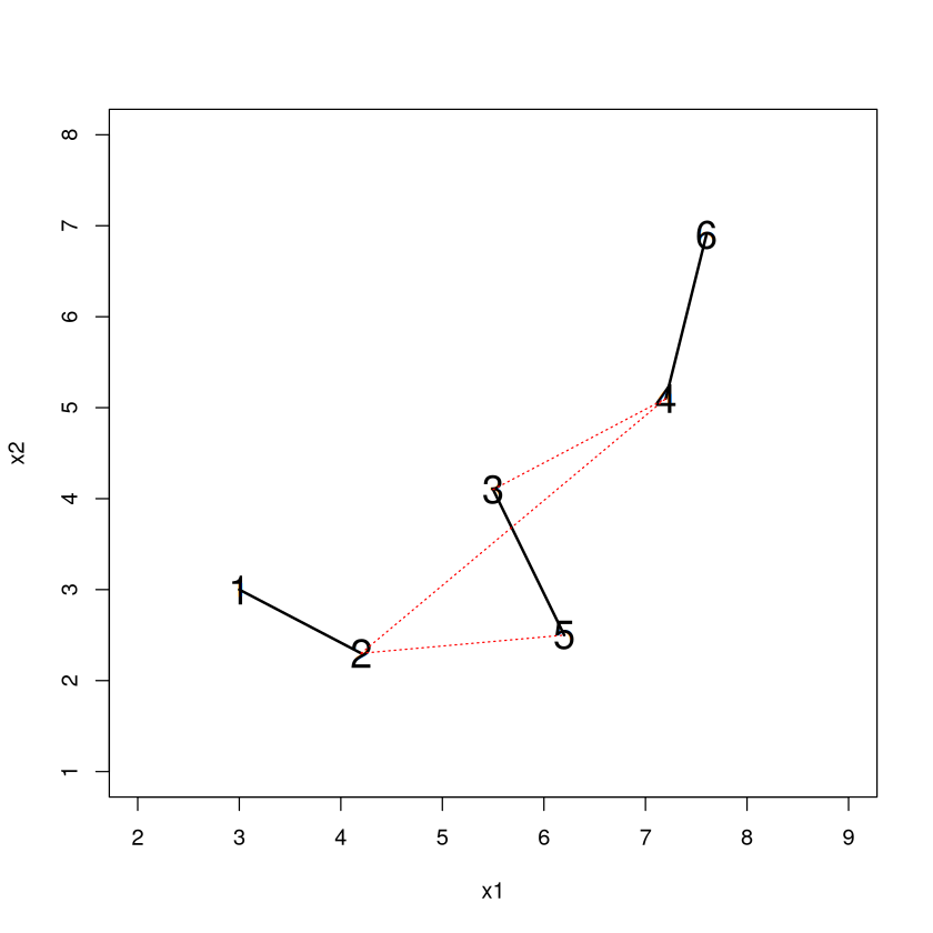
Only one possible connection left. 2-5 is added and we are done.
plot(x2~x1,xlim=c(2,9),ylim=c(1,8),pch=20,cex=2,col="white")
for (i in 1:6) { text(x1[i],x2[i],i,cex=1.8) }
lines( c(x1[1],x1[2]), c(x2[1],x2[2]),lwd=2)
lines( c(x1[3],x1[5]), c(x2[3],x2[5]),lwd=2)
lines( c(x1[4],x1[6]), c(x2[4],x2[6]),lwd=2)
lines( c(x1[3],x1[4]), c(x2[3],x2[4]),lwd=2)

lines( c(x1[2],x1[5]), c(x2[2],x2[5]),lty=3,col="red")

D[2,4] <- NA; D[4,2] <- NA
D[3,4] <- NA; D[4,3] <- NA
D
| 1 | 2 | 3 | 4 | 5 | 6 | |
|---|---|---|---|---|---|---|
| 1 | NA | NA | NA | NA | NA | NA |
| 2 | NA | NA | NA | NA | 2 | NA |
| 3 | NA | NA | NA | NA | NA | NA |
| 4 | NA | NA | NA | NA | NA | NA |
| 5 | NA | 2 | NA | NA | NA | NA |
| 6 | NA | NA | NA | NA | NA | NA |
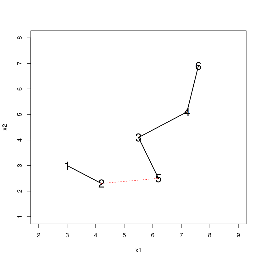
The dendrogram is a way to visualize this agglomeration. Read it from the bottom up and it tells you the order of what happened. 1-2 became a cluster, then 3-5 became a cluster, then 4-6 became a cluster, then the 3/5 - 4/6 clusters merged together.
The “Height” (vertical axis) where clusters merge tells us the ``distance” between them when they merged.
HC <- hclust(dist(DATA),method="single"); plot(HC)

Choosing Clusters#
The great thing about hierarchical clustering that \(K\)-means lacks is the ability to decide on the number of clusters and determine the cluster identities immediately without rerunning the algorithm. To get 3 clusters we ``cut” the dendrogram so that a horizontal line passes through 3 vertical branches.
A cut at 1.9 implies that entities belong in a different cluster if they are a distance of 1.9 or bigger. Note that everything hanging off a line intersecting the cut will belong in a cluster together, so 1-2, 3-5, and 4-6 are our three clusters.
plot(HC); abline(h=1.9,col="red")

Another nice thing about hierarchical clustering is that when you add an additional cluster to the scheme, an existing cluster gets split in two (not necessarily 50-50)! This makes it particularly easy to see how the scheme changes when one more cluster is added (since all but one of the ``old” clusters will be the same).
\(K\)-means does not have this property. When you add an additional cluster in \(K\)-means, it can be the case that each cluster in the new scheme has noticeable differences from clusters in the old scheme.
In fact, with some care, hierarchical clustering allows you to glimpse the result of splitting any one of the existing clusters in your scheme into two smaller clusters.
Note
Because of this property, it is my opinion that hierarchical clustering is actually more useful for doing business analytics than \(K\)-means. Why isn’t it more widespread? I think it’s because people aren’t aware of it.
Recovering the cluster identities is easy in R with \(cutree\). You can specify the ``height” of the dendrogram where you want to make the cut, or (more useful) specify the number of clusters with the \(k\) argument.
cutree(HC,h=1.9)  #Gives cluster identities if you cut at a "height" of 1.9
cutree(HC,k=2)  #Gives cluster identities if you want k clusters
- 1
- 1
- 2
- 3
- 2
- 3
- 1
- 1
- 2
- 2
- 2
- 2
Where to cut?#
Just like picking the number of clusters in \(K\)-means is not necessarily easy, picking the “right” place to cut is not always easy. Let’s revisit one of our ``toy” examples.
set.seed(474); DATA <- data.frame(x=rep(0,100),y=rep(0,100))
DATA$x[1:25] <- runif(25,0,1); DATA$y[1:25] <- runif(25,0,1)
DATA$x[26:50] <- runif(25,5,6); DATA$y[26:50] <- runif(25,0,1)
DATA$x[51:75] <- runif(25,0,1); DATA$y[51:75] <- runif(25,5,6)
DATA$x[76:100] <- runif(25,5,6); DATA$y[76:100] <- runif(25,5,6); plot(DATA)

Make the dendrogram, using ``complete” linkage clustering this time.
The existence of long, unbroken vertical stretches indicate that there is a wide separation between the clusters these branches will eventually connect. Note how the number of clusters increases extremely rapidly as values of the height get fairly small.
HC <- hclust( dist(DATA),method="complete");plot(HC,main="");abline(h=4,col="red")

Another example (our other toy example).
set.seed(474)
TOY <- data.frame(
  Group=c( rep(1,20),rep(2,30),rep(3,10),rep(4,40) ),
  x = c( rnorm(20,3,1), rnorm(30,8,1), rnorm(10,10,1), rnorm(40,11,1) ),
  y = c( rnorm(20,30,2),rnorm(30,30,2),rnorm(10,28,2), rnorm(40,27,2))
)
plot(y~x,data=TOY,pch=20)

Make the dendrogram, using ``complete” linkage clustering again.
The number of clusters slowly increases as the value of the height decreases until a height of about 7.5 or so. Personally, I take that as a sign to cut near there, which would give you 4 clusters.
HC <- hclust( dist(TOY),method="complete" );plot(HC); abline(h=7.8,col="red")

We could make a plot of the number of clusters vs. the height that the cut is made.
Maybe similar to the ``elbow” technique for \(K\)-means we could choose a height where the curvature starts to change from shallow to steep.
cut.height <- seq(3,15,by=.1); n.clust <- rep(0,length(cut.height))
for (cut in cut.height) {
  n.clust[which(cut.height==cut)] <- length(unique(cutree(HC,h=cut))) }
plot(n.clust~cut.height)

Frequent Fliers#
library(tidymodels)
Show code cell output
── Attaching packages ────────────────────────────────────────────────────────────────────────────────────────────────────────────────────────────────────────────────────────────────────────── tidymodels 1.3.0 ──
✔ broom        1.0.7     ✔ recipes      1.1.1
✔ dials        1.4.0     ✔ rsample      1.2.1
✔ dplyr        1.1.4     ✔ tibble       3.2.1
✔ ggplot2      3.5.1     ✔ tidyr        1.3.1
✔ infer        1.0.7     ✔ tune         1.3.0
✔ modeldata    1.4.0     ✔ workflows    1.2.0
✔ parsnip      1.3.0     ✔ workflowsets 1.1.0
✔ purrr        1.0.4     ✔ yardstick    1.3.2
── Conflicts ───────────────────────────────────────────────────────────────────────────────────────────────────────────────────────────────────────────────────────────────────────────── tidymodels_conflicts() ──
✖ purrr::%||%()    masks base::%||%()
✖ purrr::discard() masks scales::discard()
✖ dplyr::filter()  masks stats::filter()
✖ dplyr::lag()     masks stats::lag()
✖ recipes::step()  masks stats::step()
FLYER <- read.csv("frequentflyer.csv")

ORIG.FLYER <- FLYER #make a copy of the original

REC <- recipe(~., FLYER) %>%
    step_YeoJohnson(all_numeric()) %>%
    step_normalize(all_numeric()) %>%
    step_dummy(all_nominal()) %>%
    step_nzv() %>%
    step_corr() %>%
    step_lincomb()

REC <- prep(REC, FLYER)

FLYER <- bake(REC, FLYER)

HC <- hclust( dist(FLYER), method="complete")
plot(HC,main="",xlab=NULL)

Where would you cut? If we wanted to be consistent with \(K\)-means we could choose 4 clusters.
FLYER$clusterIDhc <- cutree(HC,k=4)
table(FLYER$clusterIDhc)
round(aggregate(.~clusterIDhc,data=FLYER,FUN=mean),digits=1)
   1    2    3    4
2985  788  163   63
| clusterIDhc | TotalMiles | StatusMiles | BonusMiles | BonusTrans | MilesLastYear | FlightsLastYear | Membershipdays |
|---|---|---|---|---|---|---|---|
| <dbl> | <dbl> | <dbl> | <dbl> | <dbl> | <dbl> | <dbl> | <dbl> |
| 1 | -0.2 | -0.2 | -0.1 | 0.0 | -0.3 | -0.3 | -0.1 |
| 2 | 0.6 | -0.2 | 0.1 | 0.0 | 0.9 | 0.9 | 0.4 |
| 3 | 0.7 | 4.1 | 0.7 | 0.8 | 0.9 | 0.9 | 0.3 |
| 4 | 0.1 | 4.1 | -0.6 | -0.8 | 0.5 | 0.5 | -0.3 |
Summary (quite a different set of clusters from \(K\)-means)
Cluster 1: a little below average in everything
Cluster 2: High TotalMiles but low StatusMiles
Cluster 3: Super stars with the total, status, and bonus miles!
Cluster 4: LOTS Of status miles, but average or below of everything else except last year, new customers?
What if we added a 5th cluster? One of these four clusters will be split in two. Maybe a new part of the story will emerge?
We see that one old cluster got split into two smaller clusters. The ``new” cluster 1 has low values in most of the dimensions than cluster 3. Interesting insight and potentially worthwhile to add to the scheme, depending on what questions we were hoping to answer.
FLYER$clusterIDhc <- cutree(HC,k=5)
table(FLYER$clusterIDhc)
round( aggregate(.~clusterIDhc,data=FLYER,FUN=mean),digits=1)
   1    2    3    4    5
1375  788 1610  163   63
| clusterIDhc | TotalMiles | StatusMiles | BonusMiles | BonusTrans | MilesLastYear | FlightsLastYear | Membershipdays |
|---|---|---|---|---|---|---|---|
| <dbl> | <dbl> | <dbl> | <dbl> | <dbl> | <dbl> | <dbl> | <dbl> |
| 1 | -0.8 | -0.2 | -0.9 | -0.9 | -0.6 | -0.6 | -0.2 |
| 2 | 0.6 | -0.2 | 0.1 | 0.0 | 0.9 | 0.9 | 0.4 |
| 3 | 0.3 | -0.2 | 0.6 | 0.7 | 0.0 | 0.0 | 0.0 |
| 4 | 0.7 | 4.1 | 0.7 | 0.8 | 0.9 | 0.9 | 0.3 |
| 5 | 0.1 | 4.1 | -0.6 | -0.8 | 0.5 | 0.5 | -0.3 |
It can also be helpful to just look at the median (not average, because the original distributions were so skewed) values of each characteristic for each cluster too to get more specific than ‘’above average”, ‘’below average”, etc. Sometimes a clearer story emerges.
ORIG.FLYER$clusterIDhc <- FLYER$clusterIDhc  #put IDs into original data
aggregate(.~clusterIDhc,data=ORIG.FLYER,FUN=median)
| clusterIDhc | TotalMiles | StatusMiles | BonusMiles | BonusTrans | MilesLastYear | FlightsLastYear | Membershipdays |
|---|---|---|---|---|---|---|---|
| <int> | <dbl> | <dbl> | <dbl> | <dbl> | <dbl> | <dbl> | <dbl> |
| 1 | 17648.0 | 0 | 648.0 | 3 | 0 | 0 | 1405.0 |
| 2 | 84729.5 | 0 | 5350.0 | 8 | 500 | 1 | 1767.5 |
| 3 | 61362.5 | 0 | 20841.5 | 16 | 0 | 0 | 1471.5 |
| 4 | 89112.0 | 1896 | 20500.0 | 18 | 850 | 3 | 1630.0 |
| 5 | 46378.0 | 1745 | 2358.0 | 4 | 100 | 1 | 1452.0 |
Again, I think the best strategy for choosing the number of clusters is time consuming and requires a lot of thought. Start out with a ``reasonable” number, then:
Characterize the clustering scheme by seeing how the individuals in each cluster differ from each other, and think about what you want out of the clustering scheme.
If two or more clusters have no ``meaningful differences”, fit a scheme with one fewer cluster and try again.
If each cluster has ``meaningful differences” between them, fit a scheme with one more cluster.
Repeat until you feel that all clusters are ``interesting” and have meaningful differences, and that adding another cluster doesn’t further add to your understanding of the data.