Clustering Algorithm: \(K\)-means#
The Basics - motivation with toy example#
Although clustering really should only be done in the context of a specific business problem, the techniques can be illustrated through the use of simple ``toy” datasets.
Imagine we have data on two characteristics of individuals: \(x_1\) and \(x_2\) (maybe yearly income and number of children; perhaps we want to develop clusters and study vacationing habits).
set.seed(474); TOY <- data.frame(
  Group=c( rep(1,20),rep(2,30),rep(3,10),rep(4,40) ),
  x1 = c( rnorm(20,3,1), rnorm(30,8,1), rnorm(10,10,1), rnorm(40,11,1) ),
  x2 = c( rnorm(20,30,2),rnorm(30,30,2),rnorm(10,28,2), rnorm(40,27,2))
)
plot(x2~x1,data=TOY,pch=20)  #color code by group number

So how many clusters are there? To the eyes, one ``group” has values of \(x1\) near 2 while the other has value of \(x1\) between 8-12 (both groups have similar \(x2\) values). But even if we made two clusters, so what? By themselves (without context or a problem to solve) the clusters aren’t meaningful. Maybe identifying these clusters could serve as the jumping off point for some descriptive analytics (so we see two groups, but what important and meaningful ways do they differ based on other things, like travel habits, we know about the individuals).
The Algorithm and Illustration#
The \(K\)-means algorithm for assigning individuals to clusters is perhaps the most popular clustering algorithm because it is easy to understand how it works. Given a number of clusters \(K\) to find (which you have to specify), the algorithm proceeds as follows.
randomly pick \(K\) points in the data space (or \(K\) individuals) to be the initial \(K\) cluster centers
calculate each individual’s ``distance” (we will always take Euclidean distance, but there are other ways to measure it) to the \(K\) cluster centers and assign membership based on which center is closest.
once each individual has been assigned a cluster membership, recalculate the cluster center to be the ``center of mass” (average) of the individuals in that cluster.
repeat steps 2 and 3 until ``convergence” (there is no further change in cluster memberships or centers)
Let’s use our toy example. You know enough at this point to be able to completely program \(K\)-means yourself (though we will be using \(kmeans\) in \(R\))!
Step 1 First step is to choose the cluster centers at random.
set.seed(474)
#Vector (x,y) for centers, picked at random between the min/max values of the variables
center1 <- c( runif(1,min(TOY$x1),max(TOY$x1)), runif(1,min(TOY$x2),max(TOY$x2)) )
center2 <- c( runif(1,min(TOY$x1),max(TOY$x1)), runif(1,min(TOY$x2),max(TOY$x2)) )
plot(x2~x1,data=TOY,pch=20)  #color code by group number
points(center1[1],center1[2],col="black",pch=8,cex=2)  #Randomly picked cluster center 1
points(center2[1],center2[2],col="red",pch=8,cex=2)  #Randomly picked cluster center 2

Step 2 Now we calculate each individual’s ``distance” from the cluster centers, and assign memberships based on which is closest. Again, all of our examples will take the dissimilarity or distance to be Euclidean distance, but there are other ways of quantifying this measure!
membership <- c()
for (i in 1:nrow(TOY)) {  #loop through each individual
  #x1 coordinate of first cluster is center1[1]; x1 coordinate of 2nd cluster is center2[1]
  #x2 coordinate of first cluster is center1[2]; x2 coordinate of 2nd cluster is center2[2]
  distance.from.1 <- sqrt( (TOY$x1[i]-center1[1])^2 + (TOY$x2[i]-center1[2])^2 )
  distance.from.2 <- sqrt( (TOY$x1[i]-center2[1])^2 + (TOY$x2[i]-center2[2])^2 )
  if(distance.from.1 < distance.from.2) { membership[i] <- 1 } else {membership[i] <- 2}
}
Let’s see our initial cluster identities. Note: because the \(x1\) and \(x2\) scales are different and because the plot is a rectangle, the aspect ratio is off and the distance isn’t quite exactly what a ruler would measure. If the color-coding of the points is not quite what you expected, that is why!
plot(x2~x1,data=TOY,pch=20,col=membership)  #color code by group number
points(center1[1],center1[2],col="black",pch=8,cex=2)  #Randomly picked cluster center 1
points(center2[1],center2[2],col="red",pch=8,cex=2)  #Randomly picked cluster center 2

Step 3 Update cluster identities:
plot(x2~x1,data=TOY,pch=20,col=membership)  #color code by group number
old.center1 <- center1; old.center2 <- center2
points(old.center1[1],old.center1[2],col="black",pch=8,cex=2)
points(old.center2[1],old.center2[2],col="red",pch=8,cex=2)
center1 <- c( mean(TOY$x1[which(membership==1)]), mean(TOY$x2[which(membership==1)] ) )
center2 <- c( mean(TOY$x1[which(membership==2)]), mean(TOY$x2[which(membership==2)] ) )
points(center1[1],center1[2],col="black",pch=8,cex=4)
points(center2[1],center2[2],col="red",pch=8,cex=4)
lines( c(old.center1[1],center1[1]), c(old.center1[2],center1[2]) )
lines( c(old.center2[1],center2[1]), c(old.center2[2],center2[2]), col="red" )

Step 2 Now we update each individual’s ``distance” from the cluster centers and assign memberships based on which is closest.
membership <- c()
for (i in 1:nrow(TOY)) {
  distance.from.1 <- sqrt( (TOY$x1[i]-center1[1])^2 + (TOY$x2[i]-center1[2])^2 )
  distance.from.2 <- sqrt( (TOY$x1[i]-center2[1])^2 + (TOY$x2[i]-center2[2])^2 )
  if(distance.from.1 < distance.from.2) { membership[i] <- 1 } else {membership[i] <- 2}
}
Step 3 Update cluster identities:
plot(x2~x1,data=TOY,pch=20,col=membership)  #color code by group number
old.center1 <- center1; old.center2 <- center2
points(old.center1[1],old.center1[2],col="black",pch=8,cex=2)
points(old.center2[1],old.center2[2],col="red",pch=8,cex=2)
center1 <- c( mean(TOY$x1[which(membership==1)]), mean(TOY$x2[which(membership==1)] ) )
center2 <- c( mean(TOY$x1[which(membership==2)]), mean(TOY$x2[which(membership==2)] ) )
points(center1[1],center1[2],col="black",pch=8,cex=4)
points(center2[1],center2[2],col="red",pch=8,cex=4)
lines( c(old.center1[1],center1[1]), c(old.center1[2],center1[2]) )
lines( c(old.center2[1],center2[1]), c(old.center2[2],center2[2]), col="red" )

We need to repeat steps 2 and 3 until ``convergence”, in other words the identities don’t change anymore. This is a perfect place for a \(while\) loop! We are keeping track of \(old.center1\) and \(old.center2\) and updating \(center1\) and \(center2\), so we can continue to repeat the code until these don’t change.
#all() returns TRUE if all elements in () evaluate to TRUE
#While there are differences between old.centers and new centers...
while( all(old.center1==center1) == FALSE | all(old.center2==center2) == FALSE ) {
  #copy current centers into old.center
  old.center1 <- center1; old.center2 <- center2
  #update cluster centers
  center1 <- c( mean(TOY$x1[which(membership==1)]), mean(TOY$x2[which(membership==1)] ) )
  center2 <- c( mean(TOY$x1[which(membership==2)]), mean(TOY$x2[which(membership==2)] ) )
  #update membership
  membership <- c()
  for (i in 1:nrow(TOY)) {
    distance.from.1 <- sqrt( (TOY$x1[i]-center1[1])^2 + (TOY$x2[i]-center1[2])^2 )
    distance.from.2 <- sqrt( (TOY$x1[i]-center2[1])^2 + (TOY$x2[i]-center2[2])^2 )
    if(distance.from.1 < distance.from.2) { membership[i] <- 1 } else {membership[i] <- 2}
  }
}
Final clustering scheme#
The final clusters are shown below.
plot(x2~x1,data=TOY,pch=20,col=membership)  #color code by group number
points(center1[1],center1[2],col="black",pch=8,cex=4)
points(center2[1],center2[2],col="red",pch=8,cex=4)

Most of the examples in textbooks, on the web, etc., illustrate \(K\)-means by comparing the cluster identities output by \(K\)-means with the ``actual” classes (e.g., the actual flower species vs. the cluster each flower ended up in). This is fundamentally the wrong way to think about \(K\)-means.
Note
\(K\)-means is not a tool for predictive analytics or for classification. Illustrating \(K\)-means by comparing the inferred cluster identities to ``actual” class labels (which the algorithm did not have access to as it ran) is extremely unfair and is comparing apples to oranges.
The comparison happens because people always want to know if the clusters found by \(K\)-means are ``right”. That is not the point. \(K\)-means does a good job at grouping together similar individuals. Depending on your definition of similarity and the characteristics you’ve recorded about each individual, the clusters may happen to match up to some external classification of individuals, but it’s not the job of \(K\)-means to do so!
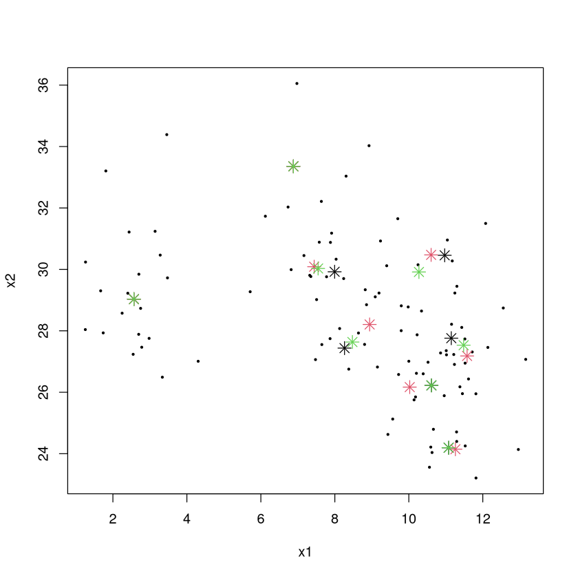
Unfortunately, the “final” clustering obtained via \(K\)-means isn’t definitive: if a different set of random points is chosen as the initial cluster centers, a different set of ``final” clusters may result.
Below are the “final” cluster centers for 3 different attempts at the \(K\)-means algorithm with 8 clusters (black, red, green are the centers, though sometimes they match up so you may not see 8 instances of red centers).
set.seed(474)
CLUSTER1 <- kmeans(TOY[,2:3],center=8,iter.max=100)$centers
CLUSTER2 <- kmeans(TOY[,2:3],center=8,iter.max=100)$centers
CLUSTER3 <- kmeans(TOY[,2:3],center=8,iter.max=100)$centers
plot(x2~x1,data=TOY,pch=20,cex=0.5)  #color code by group number
points(CLUSTER1[,1],CLUSTER1[,2],pch=8,cex=1.5,col=1)
points(CLUSTER2[,1],CLUSTER2[,2],pch=8,cex=1.5,col=2)
points(CLUSTER3[,1],CLUSTER3[,2],pch=8,cex=1.5,col=3)
What is \(K\)-means trying to do?#
Why are there different solutions? Which one is best? The \(K\)-means algorithm is trying to solve the following problem:
Given a set of \(n\) individuals, partition them into \(k\) sets to that the ``within-cluster sum of squares” (WCSS) is minimized.
\(\mu\) is the average (cluster’s center of mass) of all individuals in the cluster
Since \((x - \mu)^2\) is the square of the Euclidean distance between the cluster average we can interpret this a little more clearly:
Note
\(K\)-means splits the individuals into \(K\) clusters so that the total sum of squared distances between individuals and their cluster centers is as small as possible.
It turns out that the problem \(K\)-means is trying to solve is “NP-complete”. This is the hardest class of problems known to exist! We don’t know how to find the exact solution quickly, and there is serious doubt doing so is possible without further technological innovation (e.g., quantum computers).
Note
Upshot: the \(K\)-means algorithm only provides a way to get to a “decent” solution. It is important to redo the \(K\)-means algorithms many times with different initial random cluster centers to increase the chance at finding the ``optimal” solution.
Choosing \(K\)#
Adding a new predictor to a regression model, adding a new rule to a partition tree, etc., always makes the model fit the (training) data better because of the model’s additional flexibility.
Increasing \(K\) by 1 will always make the total sum of squared distances get smaller.
In predictive analytics, we could choose the appropriate number of variables in the model or its appropriate complexity by performing cross-validation. We can’t do that here because we are doing unsupervised learning! There are no “answers” to check or “error” associated with a model to compute.
Choosing \(K\) (the number of clusters) is an art!
Choosing \(K\) - elbow method#
We will choose the value of \(K\) using the ``elbow” method:
Calculate the within-cluster sum of squares (sum of squared distances of individuals from their cluster centers) for \(K=1, 2, \ldots\) and plot that vs. \(K\)
The values will continue to get smaller as \(K\) gets larger, but increasing \(K\) will eventually give diminishing returns on the improvement of the clustering scheme (as measured by the amount of reduction in the sum of within cluster sum of squares).
A reasonable choice of \(K\) is at the “elbow” of this plot, where the decrease goes from fast to slow.
For example, let us have 4 extremely widely separated clusters and look at the within-cluster sum of squares vs. \(K\).
set.seed(474); DATA <- data.frame(x=rep(0,100),y=rep(0,100))
DATA$x[1:25] <- runif(25,0,1); DATA$y[1:25] <- runif(25,0,1)
DATA$x[26:50] <- runif(25,5,6); DATA$y[26:50] <- runif(25,0,1)
DATA$x[51:75] <- runif(25,0,1); DATA$y[51:75] <- runif(25,5,6)
DATA$x[76:100] <- runif(25,5,6); DATA$y[76:100] <- runif(25,5,6)
plot(DATA)

The “ideal” chart. The total sum of squared distances between individuals and their cluster centers (WCSS) gets smaller through \(K=4\). While it decreases going to 5, 6, etc., the decrease is much less pronounced. The ``elbow” method would have us pick \(K=4\) here which is a very reasonable choice.
WCSS <- c(); possible.k <- 1:10
set.seed(474)  #important since kmeans uses random initial centers
for (i in possible.k) { CL <- kmeans(DATA,center=i,iter.max=100); WCSS[i] <- CL$tot.withinss }
plot(WCSS~possible.k,pch=20,cex=2)

Choosing \(K\) in practice#
The elbow rule provides a good suggestion, but you’ll rarely if ever come across a plot like in the last slide where the choice is obvious. Let’s look at our toy example.
WCSS <- c(); possible.k <- 1:10
set.seed(474)  #important since kmeans uses random initial centers
for (i in possible.k) { CL <- kmeans(TOY,center=i,iter.max=100); WCSS[i] <- CL$tot.withinss }
plot(WCSS~possible.k,pch=20,cex=2)

The elbow rule would suggest taking \(K=3\) (in my judgment) because the improvement from 2 to 3 is pretty impressive while going from 3 to 4 does not give that much improvement.
Since clustering is unsupervised, there is not a ``correct” answer for \(K\) because there is no pre-defined target the scheme is trying to reproduce. However, certain numbers of clusters make more sense than others. Consider market segmentation.
An advertisement that is individually tailored to each potential and existing customer of a store will have the highest response rate of any campaign.
A generic message tailored to the ``average” customer will have the lowest response rate.
Having three messages tailored to three clusters will be somewhere in between.
More clusters = more revenue.
However:
A messaged tailored to every individual will have the highest cost.
The generic message to the average will have the lowest cost.
Three messages targeting three different segments will have a cost somewhere in between.
More clusters = more cost!
The ``right” number of clusters will be the one that provides the best balance between revenue and cost.
Imagine a writer charges us $1000 per tailored message. While more messages (and a greater degree of tailoring) brings in more revenue, there is diminishing returns.
Clusters |
Revenue |
Cost |
Profit |
|---|---|---|---|
1 |
5000 |
1000 |
4000 |
2 |
7500 |
2000 |
5500 |
3 |
9000 |
3000 |
6000 |
4 |
9500 |
4000 |
5500 |
While the revenue based on the number of clusters is surely a guess in this example, it illustrates the point. Every value of \(K\) provides a valid way to cluster the individuals. Depending on the context and what the clusters are going to be used for, some choices make more sense than others.
The ``right way” to choose \(K\)#
Look at the WCSS and see the smallest reasonable value for the number of clusters.
Characterize the clustering scheme by seeing how the individuals in each cluster differ from each other, and think about what you want out of the clustering scheme.
If two or more clusters have no ``meaningful differences”, fit a scheme with one fewer cluster and try again.
If each cluster has ``meaningful differences” between them, fit a scheme with one more cluster.
Repeat until you feel that all clusters are ``interesting” and have meaningful differences, and that adding another cluster doesn’t further add to your understanding of the data.
What do you do with your final cluster scheme?#
After you’ve chosen \(K\), finalized your clustering scheme, and determined who belongs to what cluster, then what?
Make a table of the average values of each (transformed/scaled) characteristic for each cluster and look for ``cluster-defining characteristics” and patterns that distinguish one cluster from another.
Make a table of the median values of each (original valued) characteristic for each cluster and look for patterns that distinguish one cluster from another.
Determine whether the differences between clusters are
interesting" oruseful” for what the clusters are being used for (clustering without a context yields only ``fun and interesting facts”).
Example: \(iris\) data; 4 clusters based on measurements of flower parts. Look at average value of each characteristic for each cluster and determine ``cluster-defining characteristics” by noting which averages are far above/below 0.
data(iris); iris$Species <- NULL; iris.scaled <- as.data.frame(scale(iris))
set.seed(474); CLUSTER <- kmeans(iris.scaled,center=4,iter.max=100,nstart=50)
round( CLUSTER$centers, digits = 1 )
| Sepal.Length | Sepal.Width | Petal.Length | Petal.Width | |
|---|---|---|---|---|
| 1 | -1.3 | 0.2 | -1.3 | -1.3 |
| 2 | 1.1 | 0.1 | 1.0 | 1.0 |
| 3 | -0.7 | 1.5 | -1.3 | -1.2 |
| 4 | -0.1 | -0.9 | 0.3 | 0.3 |
A number close to 0 means that characteristic is close to the overall average among all individuals.
Positive numbers mean individuals in that cluster are above average.
Negative numbers mean individuals in that cluster are below average.
Numbers around \(\pm\) 1 or higher typically mean individuals in that cluster are “pretty different” than individuals in other clusters with regard to that characteristic, and that it could be considered a ``cluster-defining characteristic”.
Number around \(\pm\) 2 or \(\pm\) 3 are really eyecatching!
data(iris); iris$Species <- NULL; iris.scaled <- as.data.frame(scale(iris))
set.seed(474); CLUSTER <- kmeans(iris.scaled,center=4,iter.max=100,nstart=50)
round( CLUSTER$centers, digits = 1 )
| Sepal.Length | Sepal.Width | Petal.Length | Petal.Width | |
|---|---|---|---|---|
| 1 | -1.3 | 0.2 | -1.3 | -1.3 |
| 2 | 1.1 | 0.1 | 1.0 | 1.0 |
| 3 | -0.7 | 1.5 | -1.3 | -1.2 |
| 4 | -0.1 | -0.9 | 0.3 | 0.3 |
Cluster 1 characterized by very below-average values of sepal length and petal length/width
Cluster 2 characterized as having below-average values of sepal width
Cluster 3 characterized by very above-average values of sepal length and petal length/width (very different than cluster 1)
Cluster 4 characterized by very above-average values of sepal width and very below-average values of petal length and petal width.
Examine medians (have to add cluster identities to dataframe)
iris.with.clusterID <- iris; iris.with.clusterID$ID <- CLUSTER$cluster
aggregate( . ~ ID, data=iris.with.clusterID,FUN=median)
| ID | Sepal.Length | Sepal.Width | Petal.Length | Petal.Width |
|---|---|---|---|---|
| <int> | <dbl> | <dbl> | <dbl> | <dbl> |
| 1 | 4.8 | 3.2 | 1.4 | 0.2 |
| 2 | 6.7 | 3.1 | 5.6 | 2.0 |
| 3 | 5.2 | 3.7 | 1.5 | 0.2 |
| 4 | 5.8 | 2.7 | 4.4 | 1.3 |
The medians give an idea of the size of the differences between clusters. For example, Clusters 1 and 4 sure do have values of petal length that are very different from the other two clusters. One “interesting” observations is that members in Cluster 2 seems to be similar to members in Cluster 3, just ``smaller”. One might wonder if this distinction is meaningful enough to justify it as a separate cluster.
Pros and Cons of \(K\)-means#
Pros
Intuitive and easy to explain; ``should” work
``Easy” to implement
People are very comfortable using the results of \(K\)-means.
Cons
A bit disconcerting and unsettling to get a different set of clusters when a different set of initial centers are picked at random (though taking the one that had the lowest WCSS after, say, 15 attempts mostly nullifies this drawback).
Hard to discern the
most useful" number of clusters (and there's noright” answer).Heavily relies (like all clustering schemes) on appropriate choice of distance. \(K\)-means works best of the shape of clusters are spherical blobs in the data space.
Doesn’t work well in high-dimensional data spaces.
Example: Frequent Fliers#
library(tidymodels)
library(Hmisc)
Show code cell output
── Attaching packages ────────────────────────────────────────────────────────────────────────────────────────────────────────────────────────────────────────────────────────────────────────── tidymodels 1.3.0 ──
✔ broom        1.0.7     ✔ recipes      1.1.1
✔ dials        1.4.0     ✔ rsample      1.2.1
✔ dplyr        1.1.4     ✔ tibble       3.2.1
✔ ggplot2      3.5.1     ✔ tidyr        1.3.1
✔ infer        1.0.7     ✔ tune         1.3.0
✔ modeldata    1.4.0     ✔ workflows    1.2.0
✔ parsnip      1.3.0     ✔ workflowsets 1.1.0
✔ purrr        1.0.4     ✔ yardstick    1.3.2
── Conflicts ───────────────────────────────────────────────────────────────────────────────────────────────────────────────────────────────────────────────────────────────────────────── tidymodels_conflicts() ──
✖ purrr::%||%()    masks base::%||%()
✖ purrr::discard() masks scales::discard()
✖ dplyr::filter()  masks stats::filter()
✖ dplyr::lag()     masks stats::lag()
✖ recipes::step()  masks stats::step()
Attaching package: ‘Hmisc’
The following object is masked from ‘package:parsnip’:

    translate
The following objects are masked from ‘package:dplyr’:

    src, summarize
The following objects are masked from ‘package:base’:

    format.pval, units
Data on almost 4000 member of a frequent flier program. Let’s perform a market segmentation and see what, if any, clusters of similar customers exist. Note: data has been somewhat anonymized by scaling the original values (e.g., membership days). Take the ``originally recorded values” with a grain of salt.
\(TotalMiles\) number of miles eligible for award travel
\(StatusMiles\) number of miles qualifying for special status (e.g., gold member)
\(BonusMiles\) number of miles earn through nonflight means (e.g., credit card charges)
\(BonusTrans\) number of bonus transactions in last 12 months
\(MilesLastYear\) number of miles accrued in the last 12 months
\(FlightsLastYear\) number of flights taken in the last 12 months
\(Membershipdays\) number of days customer has been a member of the program
FLYER <- read.csv("frequentflyer.csv")
summary(FLYER)
   TotalMiles       StatusMiles        BonusMiles       BonusTrans
 Min.   :      0   Min.   :    0.0   Min.   :     0   Min.   : 0.0
 1st Qu.:  18528   1st Qu.:    0.0   1st Qu.:  1250   1st Qu.: 3.0
 Median :  43097   Median :    0.0   Median :  7171   Median :12.0
 Mean   :  73601   Mean   :  144.1   Mean   : 17145   Mean   :11.6
 3rd Qu.:  92404   3rd Qu.:    0.0   3rd Qu.: 23800   3rd Qu.:17.0
 Max.   :1704838   Max.   :11148.0   Max.   :263685   Max.   :86.0
 MilesLastYear     FlightsLastYear  Membershipdays
 Min.   :    0.0   Min.   : 0.000   Min.   : 780
 1st Qu.:    0.0   1st Qu.: 0.000   1st Qu.:1190
 Median :    0.0   Median : 0.000   Median :1501
 Mean   :  460.1   Mean   : 1.374   Mean   :1505
 3rd Qu.:  311.0   3rd Qu.: 1.000   3rd Qu.:1799
 Max.   :30817.0   Max.   :53.000   Max.   :2240
While there are no obvious data integrity issues (missing or logically wrong values), the recorded values are not suitable to do clustering because: (1) the variables are on different scales, and (2) the distributions (except \(MembershipDays\)) are extremely skewed.
hist.data.frame(FLYER)

Because \(K\)-means proceeds by clustering based on Euclidean (ruler) distances, the distributions of the variables need to vary over approximately the same range so each ``counts” the same amount towards the measure of distance. Further, the distributions need to be roughly symmetric so that the clustering scheme isn’t overly sensitive to outliers with extremely large or unusual values of the characteristics.
ORIG.FLYER <- FLYER #make a copy of the original

REC <- recipe(~., FLYER) %>%
    step_YeoJohnson(all_numeric()) %>%
    step_normalize(all_numeric()) %>%
    step_dummy(all_nominal()) %>%
    step_nzv() %>%
    step_corr() %>%
    step_lincomb()

REC <- prep(REC, FLYER)

FLYER <- bake(REC, FLYER)

hist.data.frame(FLYER)

Note that there are still some issues in the data and you should spend more time to fix them.
Let’s choose a reasonable value for \(K\), the number of clusters. At each value of \(K\), let’s try 25 random re-starts and choose the best (give it 50 iterations max, which is overkill, since you often need at most a dozen, but we’ll play it safe).
WCSS <- c()
possible.k <- 1:10
set.seed(474) #important for reproducibility since kmeans uses random initial centers
for (i in possible.k) {
  #25 restarts with 50 iterations max (overkill)
  best.SS <- kmeans(FLYER,center=i,iter.max=50,nstart=25)$tot.withinss
  WCSS[i] <- best.SS
}
plot(WCSS~possible.k,pch=20,cex=2)

Like many problems, the best choice of \(K\) is not obvious.
There is a big drop in WCSS from 2-3 clusters, so we can almost surely say that having 3 clusters will be more useful than 2 (plus, just thinking about we’d expect more than 2 overall types of fliers).
The drop from 3-4 is very modest and probably not worth the extra complexity.
The drop from 4-5 is quite large. Having 5 clusters probably yields additional insight over 4.
There doesn’t seem to be a reason to have more than 5 clusters because the improvement is very small.
The big issue here is that comparing 3 groups against each other is quite easy. Comparing 5 groups against each other is harder. Let’s start with 3, then add a fourth to see if we learn anything, etc.
The point of doing this clustering was to find fliers with similar habits. So what do these clusters look like? Since we both took the logarithms and scaled the values, we have to be careful interpreting the numbers. Remember our guidelines:
A number below 0 means that the cluster typically has values for that variable that are below the overall average in the data. A number above 0 means the opposite.
A value of 1 means the cluster average is one standard deviation above the overall average in the data. Since this is on a log scale, it’s hard to say exactly how much larger. However, a value of 2 is MUCH more than double the amount above average than a value of 1.
Cluster-defining characteristics are usually numbers that are around 1 or greater, with larger numbers being particularly more eye-catching.
set.seed(474); CLUSTER <- kmeans(FLYER,center=3,iter.max=100,nstart=50)
round(CLUSTER$centers,digits=1 )
| TotalMiles | StatusMiles | BonusMiles | BonusTrans | MilesLastYear | FlightsLastYear | Membershipdays | |
|---|---|---|---|---|---|---|---|
| 1 | 0.2 | -0.1 | 0.5 | 0.5 | -0.7 | -0.7 | 0.1 |
| 2 | 0.5 | 0.3 | 0.4 | 0.4 | 1.5 | 1.4 | 0.1 |
| 3 | -0.9 | -0.2 | -1.2 | -1.2 | -0.6 | -0.6 | -0.4 |
Individuals in cluster 1 look pretty average across the board. Individuals in cluster 2 have well-above average values of MilesLastYear and FlightsLastYear (the two values are likely correlated), while individuals in cluster 3 have well-below average values of TotalMiles, BonusMiles, and BonusTrans. Would adding a fourth be a good idea?
set.seed(474); CLUSTER <- kmeans(FLYER,center=4,iter.max=100,nstart=50)
round(CLUSTER$centers,digits=1 )
| TotalMiles | StatusMiles | BonusMiles | BonusTrans | MilesLastYear | FlightsLastYear | Membershipdays | |
|---|---|---|---|---|---|---|---|
| 1 | 0.6 | 4.1 | 0.3 | 0.4 | 0.8 | 0.8 | 0.1 |
| 2 | 0.4 | -0.2 | 0.4 | 0.4 | 1.5 | 1.4 | 0.1 |
| 3 | -0.9 | -0.2 | -1.2 | -1.2 | -0.6 | -0.6 | -0.4 |
| 4 | 0.2 | -0.2 | 0.5 | 0.5 | -0.7 | -0.7 | 0.1 |
Note: because of the random nature of \(K\)-means, the clusters will likely be labeled differently! In general, cluster 1 in a 3-cluster scheme will bear no specific relationship with the cluster 1 in a 4-cluster scheme etc! In this specific example, Cluster 4 happens to have a 4.1 in the StatusMiles, WOW! Glad we want to 4 clusters to see that. What about 5?
set.seed(474); CLUSTER <- kmeans(FLYER,center=5,iter.max=100,nstart=50)
round(CLUSTER$centers,digits=1 )
| TotalMiles | StatusMiles | BonusMiles | BonusTrans | MilesLastYear | FlightsLastYear | Membershipdays | |
|---|---|---|---|---|---|---|---|
| 1 | 0.8 | -0.2 | 0.9 | 1.0 | 1.5 | 1.4 | 0.4 |
| 2 | -0.2 | -0.2 | -0.3 | -0.4 | 1.4 | 1.4 | -0.2 |
| 3 | -0.9 | -0.2 | -1.2 | -1.2 | -0.7 | -0.7 | -0.4 |
| 4 | 0.2 | -0.2 | 0.5 | 0.5 | -0.7 | -0.7 | 0.1 |
| 5 | 0.6 | 4.1 | 0.3 | 0.4 | 0.8 | 0.8 | 0.1 |
Did going from 4 to 5 clusters increase our understanding of customers? Well, Cluster 1 was very below average values of StatusMiles and BonusMiles and is below average across the board. Cluster 3 is above average across the board with extremely large values of StatusMiles. Cluster 5 is average or below across the board. Cluster 4 is well above average in terms of MilesLastYear and FlightsLastYear. Cluster 2 is, well, hard to characterize and not much different than Cluster 5. It’s unclear to me personally what having both Clusters 2 and 5 in the scheme buy us in terms of ``actionable insight”.
I’d argue that 4 clusters ``feels right” for this situation. 3 clusters missing the group with extremely high values of StatusMiles, while 5 clusters yielded 2 groups that didn’t have any immediately obvious or useful distinctions between them. Let’s choose 4, then look at the median values of the originally recorded values.
FLYERS.with.clusterID <- ORIG.FLYER
FLYERS.with.clusterID$ID <- kmeans(FLYER,center=4,iter.max=100,nstart=50)$cluster
aggregate( . ~ ID, data=FLYERS.with.clusterID,FUN=median)
| ID | TotalMiles | StatusMiles | BonusMiles | BonusTrans | MilesLastYear | FlightsLastYear | Membershipdays |
|---|---|---|---|---|---|---|---|
| <int> | <dbl> | <dbl> | <dbl> | <dbl> | <dbl> | <dbl> | <dbl> |
| 1 | 68023 | 0 | 13051.0 | 15 | 600 | 2 | 1552 |
| 2 | 66936 | 1896 | 12100.0 | 14 | 500 | 2 | 1590 |
| 3 | 15259 | 0 | 180.5 | 1 | 0 | 0 | 1315 |
| 4 | 56451 | 0 | 15588.0 | 14 | 0 | 0 | 1553 |
Again, re-running \(K\)-means will randomly assign the cluster numbers, so Cluster 1 may not correspond to the same Cluster 1 when we looked at four clusters before. No matter, since we can still talk about what makes each cluster special!
Cluster 1 (old cluster 4) - the superstars. Highest Total Miles, StatusMiles, Membershipdays, and frequent users of the credit card and the planes themselves.
Cluster 2 (old cluster 2) - the duds. Maybe flew a little in the distant past, but they sure aren’t utilizing the credit card or airline now.
Cluster 3 (old cluster 4) - high value customers. Much like the superstars, they are using the credit card and are flying; they just seem to lack any status miles.
Cluster 4 (old cluster 1) - credit card users. They haven’t flown recently, but seem to be using the card to rack up miles.
Unfortunately, superstars (Cluster 1) are the rarest of them all, but there’s a fair amount in Cluster 3 who were the next best thing.
table(FLYERS.with.clusterID$ID)
   1    2    3    4
1103  225 1084 1587
We can see how the different variables are related for each cluster.
FLYERS.with.clusterID %>%
    ggplot(aes(x = TotalMiles+1, y = StatusMiles+1, color = as.factor(ID))) + geom_point() + scale_x_log10() + scale_y_log10()

FLYERS.with.clusterID %>%
    ggplot(aes(x = TotalMiles+1, y = BonusMiles+1, color = as.factor(ID))) + geom_point() + scale_x_log10() + scale_y_log10()
